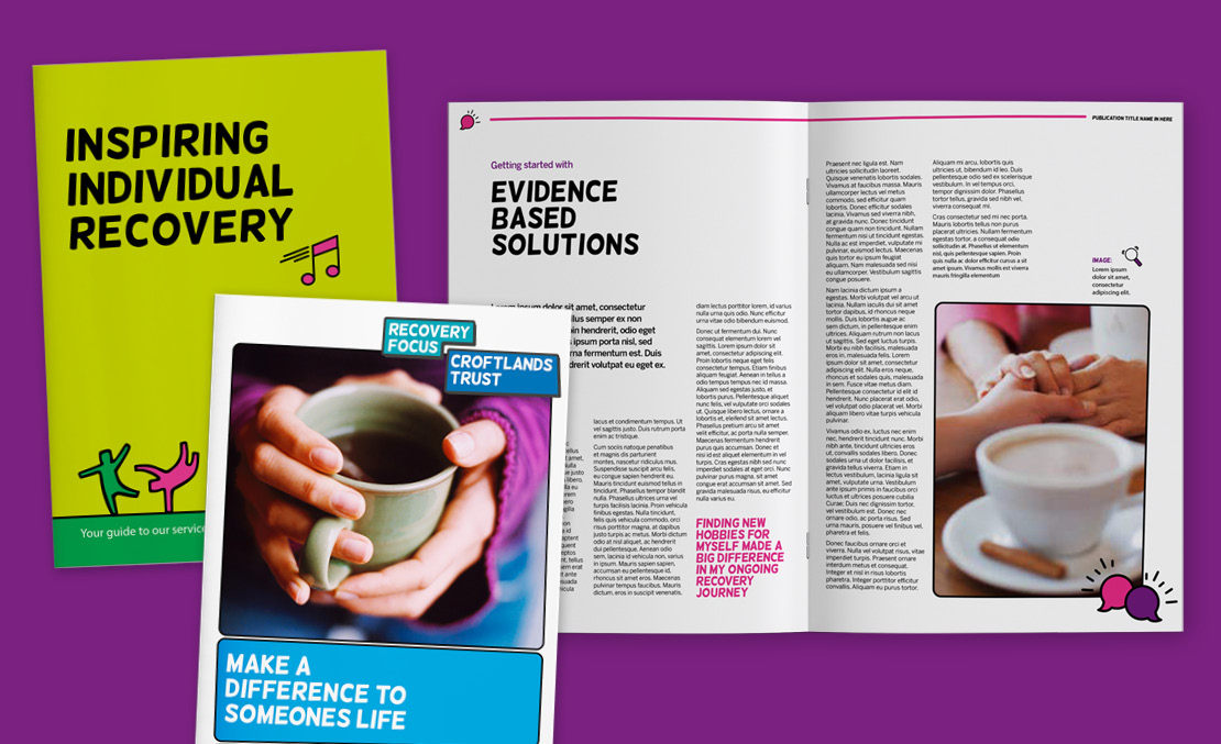
Recovery Focus is a charity that focuses on making individual recovery a reality. Having been formed through a merger of 6 small mental health charities, the challenge was to unite these organisations, who each focus on different areas of mental health. The largest of these, Richmond Fellowship, was keen to incorporate their Sparky character within the brand.
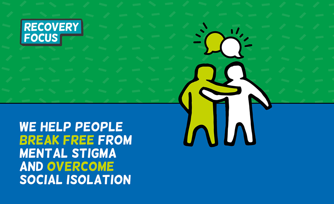
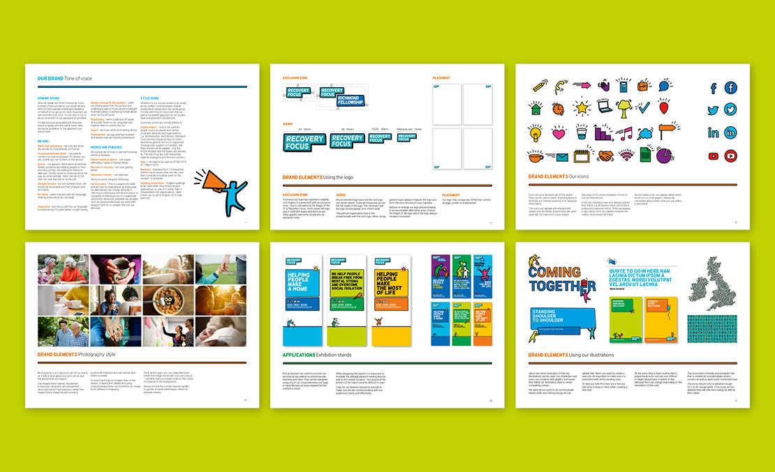
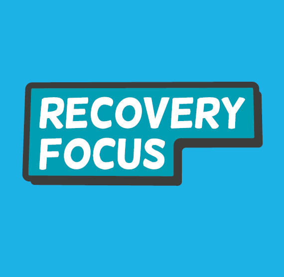
As the different organisations in the group focus on different areas of mental health, it was important that they retain their individuality whilst still being part of one group. I designed the logo as a lockup that each group can slot into. The rounded, irregular style of the typeface makes it feel approachable, whilst the badge acts as both a literal signpost to the organisation as well reflecting their journey towards recovery.
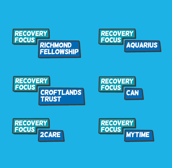
Whilst I was keen for the brand to be vibrant and upbeat, I was very aware that it had to adapt to lots of situations and be appropriate for discussing more challenging or sensitive topics. I also wanted each organisation in the group to have a bit of individuality, by offering them a wide range of visual elements to use.
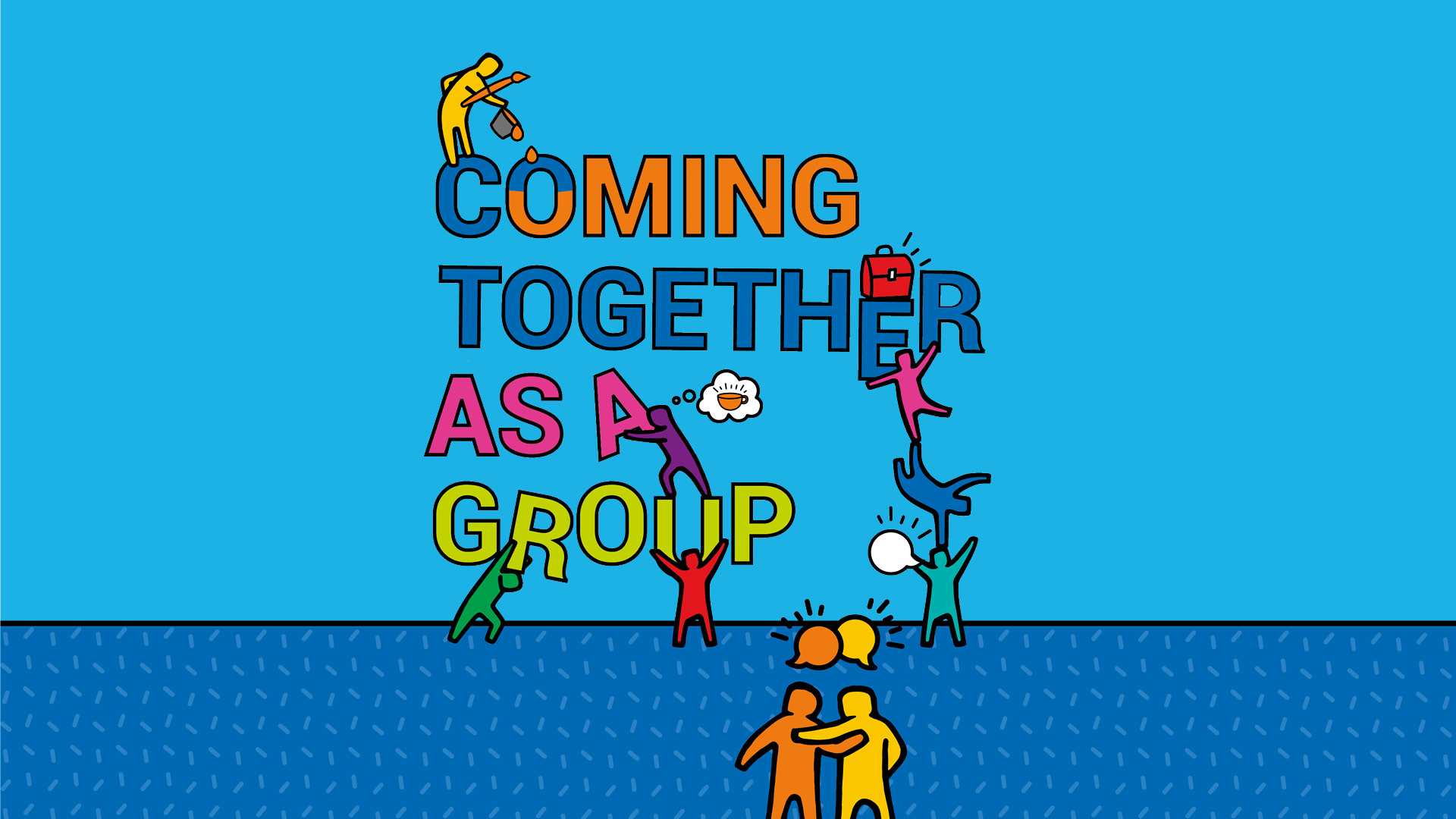
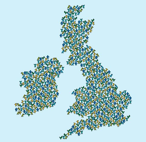
The illustration style was made up of a family of ‘sparky’ characters, who were used to reflect the diverse range of individuals who Recovery Focus work with. In addition to this, I created an icon style that could be used across all their assets. I also used the outline of the illustrations across other graphic elements, such as text boxes, to add details that tie the whole brand together.
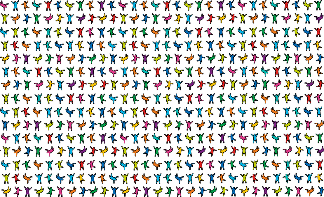
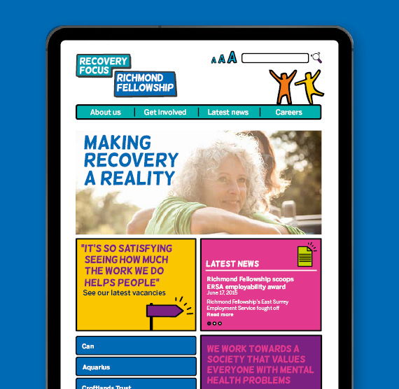
A wide colour palette was created to further the adaptability of the brand, meaning lots of colours could be used to create positive graphics, or equally more tonal colours could be used in instances where that was more appropriate for the subject. Colour was then used in the photography style to help items feel on brand even if they did not use the illustrated elements.
The tone of voice was created in close collaboration with the strategy team, creating phrases that were optimistic yet down to earth. I then created the guidelines for the brand, allowing me to showcase the flexibility of the brand and how to use it in order to maximise the communications and engagement of the organisations.