Swiss Netball
Branding & Identity | Digital | Kit Design
Empowering women in Switzerland through Netball
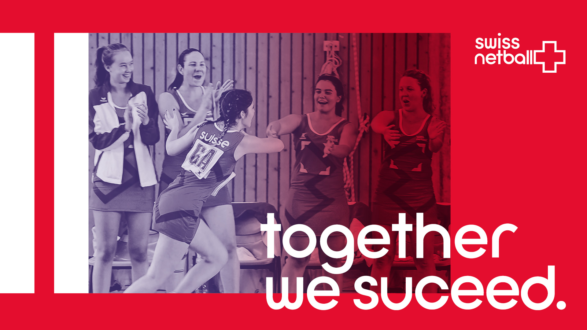
Swiss Netball was founded with the ambition to empower women through netball. They work with women and girls of all ages, across the different language regions of Switzerland, to build a community where they can learn, develop and grow. My task was to create the brand based on their values and help amplify their message.
Amplifying their values and inspiring a new generation of players
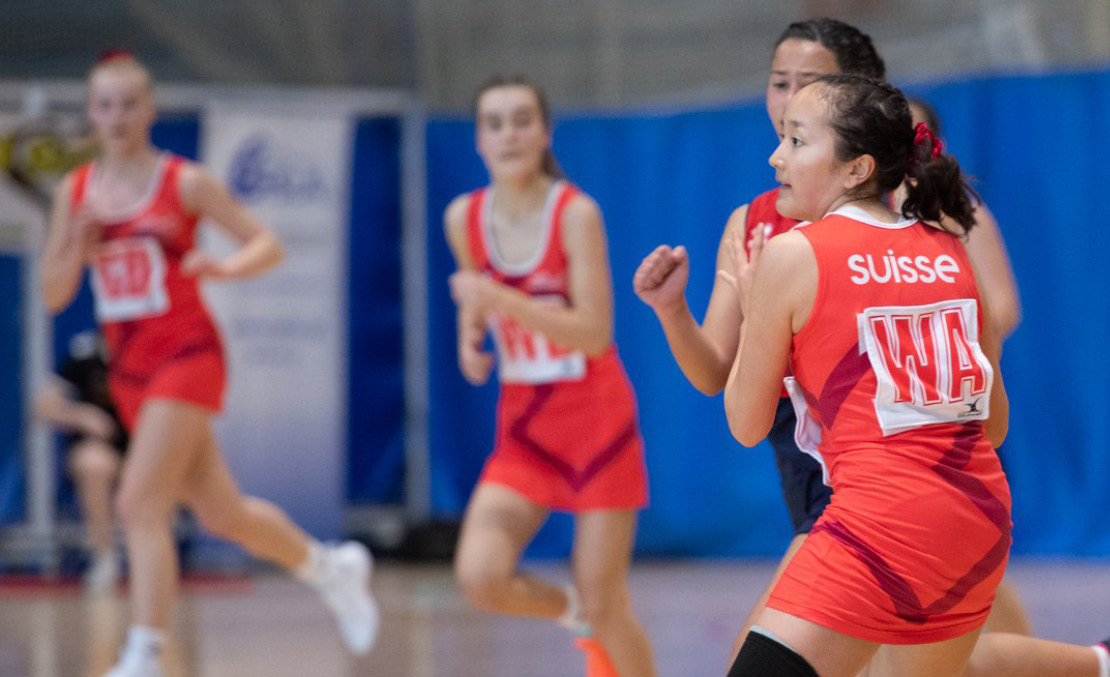
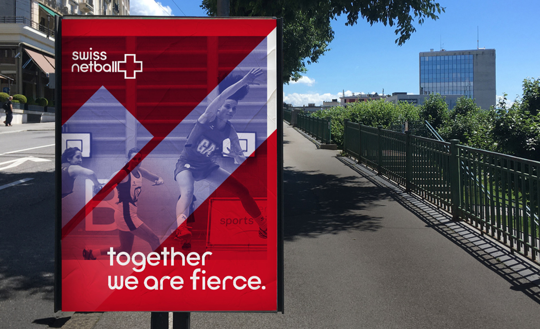
The brand is centred around the idea of community, reflecting the way the women were working together both on and off the court. However, whilst it was important to reflect the values of the organisation, I still wanted to capture the strength and athleticism of the women who play, using dynamic imagery to inspire others.
The logo plays on the motion within the sport as well as reflecting the progress driven by the organisation as a whole. The cross of the Swiss flag sits next to the logo as a key national identifier while the l's of netball create movement lines.
Giving them the letters and words to spread their message
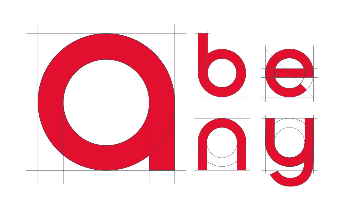
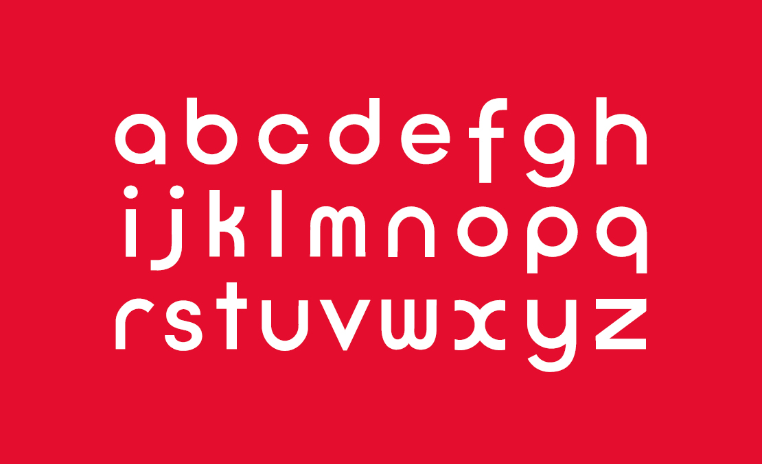
As part of their identity, I created a bespoke typeface that was inspired by the fluid motion of the players moving around the court. The letterforms are based around a circle, creating a sense of continuous, flowing motion. The geometric style also references Swiss graphic design, adding an element of national heritage to the brand.
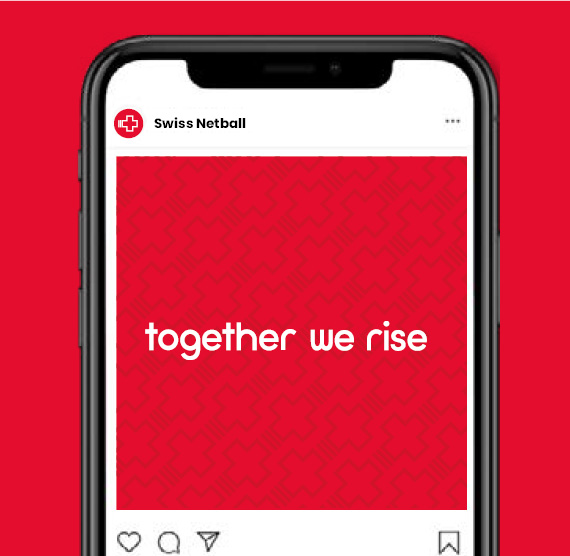
The typeface only contains lowercase letters to create a softer, more approachable feel which then contrasts with the dynamic angular graphic elements of the brand. I also created a tone of voice for Swiss Netball, using short confident statements that were easily translatable across the 4 national languages. Whilst images may focus on individual players, the language always uses ‘we’ rather than ‘I’ to emphasise the importance of the team and community.
A visual language as dynamic and flexible as the sport
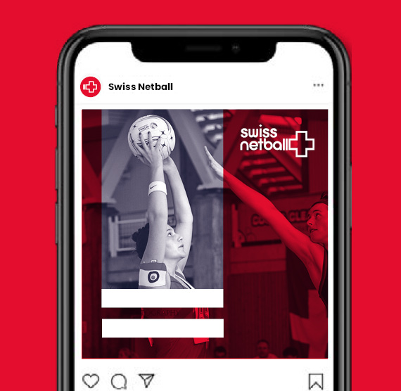
The visual brand was designed to be flexible and adaptable, so that it could grow with the organisation. Using the cross as a central graphic device, the brand uses dynamic angles and highlights to capture the energy of the sport. The photography style uses action shots of players with an emphasis on the team working together.



A uniform that unites the team
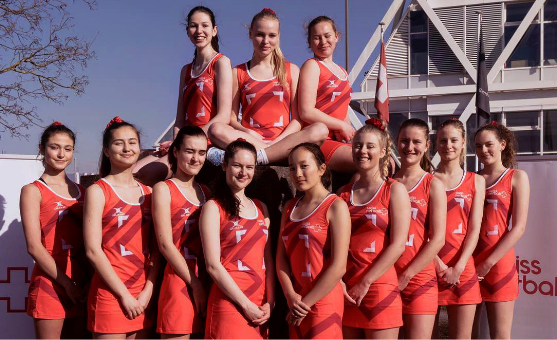
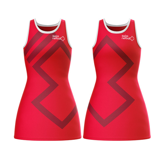
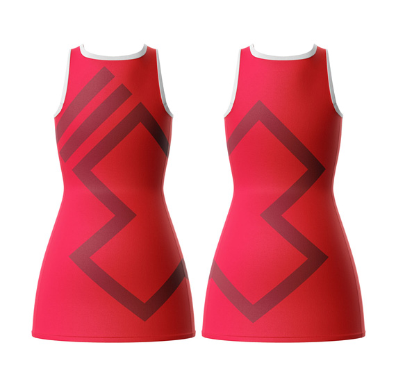
The team kit design aimed to reflect the importance of teamwork with the sport and also the organisation. The design features the moving cross graphic wrapping around the dress, creating a bold and dynamic graphic. There were then two versions created with the cross facing opposite ways, meaning that when players stood next to each other the entire cross became visible.
Connecting with fans in the digital space
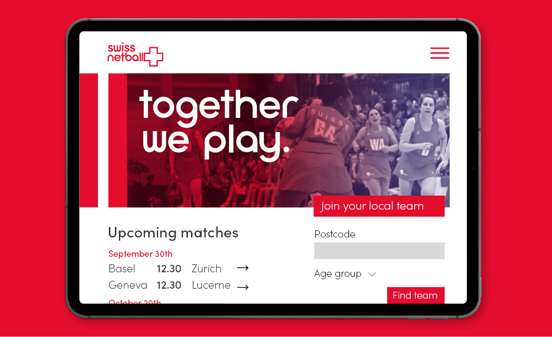
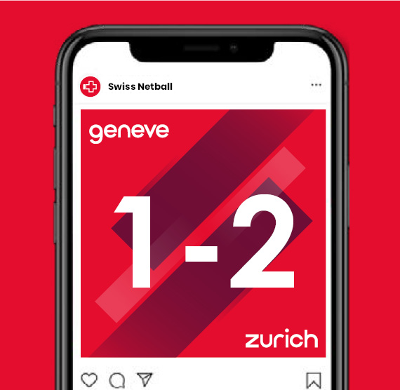
I worked with the marketing team to develop a digital strategy, including designing their website and social media content, to help them connect with fans across Switzerland and beyond.
